Friday, December 31, 2010

New Years Resolutions

     I resolve to make T shirts for Real Life Fiction! Oh wait, I just did that!

    Honestly, it's hard for me to come up with a resolution that I know I can keep. Instead, perhaps I should break it down into something bite-size that may, inadvertently, become an ongoing thing.

     This may sound like a recipe for failure, but I actually find that it works. I basically trick myself into maintaining good habits such as regular exercise. I tell myself I'll exercise for twenty minutes and then, at the twenty minute mark, decide to go for forty. 

     In the same vein, I hereby resolve to update RLF weekly, without fail, for one whole month. And at the end of that month? Well...we'll see. Hopefully I can trick myself into maintaining the trend!

Wednesday, December 29, 2010

Nostalgia

Tamit, Revisited
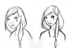
      As you've probably read on one of my other sites, I tried drawing one of my old characters from my Mixed Myth days. Much to my surprise, I really nailed the style. Having done the comic for four years must have hardwired it into my hands.

Steampunk Red Queen
     I do want to do some more stories related to Mixed Myth at some point. But doing so is awefully intimidating. I do not wish to repeat the mistakes of, for example, George Lucas and completely ruin the world for readers. Then again, Pixar has proved with its Toy Story series that you can come back to material years later and do a proper job of following up on it. So maybe there is hope. Whatever the answer is, it likely will not be anytime soon as I have my hands full with masks and RLF. But maybe I'll do more of these sketches.
Vole-Demort the Parseltongue

     The sketch in question is of Tamit. I drew her for one of those sketch cards (ACEOs) that I've been fixated on. There's three in the newest batch, including a Harry Potter parody and a Steampunk version of the Red Queen from Alice in Wonderland. As usual, you can find them listed here.


Monday, December 20, 2010

Auctions

Think I've got this ACEO thing down! Caran D'ache was the answer. The funny thing is that I've had a set of Caran D'ache sitting here for literally twenty years....and yet when I go to use them, they work just fine! Now that is a quality art supply. The only sign of their age was a bit of wax bloom on the tips that didn't interfere at all.

I retouched Alice's card and I"m much happier with the result. I also did an art nouveauish piece. Alice, the dapper Cthulhu, and the Queen of Stars are all up for auction.

Sunday, December 19, 2010

ACEOs

     I took the plunge and got a copy of Cash for Cartoonists. It's an ebook by DJ Coffman...well, more like an epamphlet. It's an interesting read. He takes a look at ways he's used to make money as an artist. Currently I do not have a job, so most of my income comes from doing masks and writing articles for the internet. Anyway, there's clearly a lot of experience in these digital pages. I think some of the numbers are a bit inflated, though. Which is not to say they're inaccurate...but a number of them are based on how big of a following you have. The results you get by trying different things are very much dependent on that.

      That said, there were a few options that I hadn't heard of before. ACEOs, for one. They're artist trading cards, basically, each one 2.5" by 3.5". They're miniature works of art, either entirely original or a limited, numbered print run. I like the idea of it as I've always had a fondness for things miniature so I decided to try my hand at it. I'm not too thrilled with the results so far, but I think the idea warrants more experimentation.

     This one started with a great idea: Steampunk Alice in Wonderland. And you know, I still might come back to that. I'm sure people have done it before, but I think it has a lot of potential even so. I tried using archival pens on this one and then adding a wash of paint over it...but my wash skills are not the greatest, as early Metrophor strips can attest to. Definitely not my preferred coloring method, though I like the ink work.


     Ah yes, dapper Cthulhu! He even has a monocle! I did him entirely in acrylic paints. Kind of like the result, but it's very time consuming. Probably too time consuming to be worth while. Plus I'm still learning to get color schemes right with paints...I mix a lot of my own colors, and that alone takes a lot of time. It might be different if I had a wide range of colors to begin with, but the expense puts a damper on things.


     This one is my favorite of the bunch. I didn't know where I was going with it when I began, but that ended up being a good thing. The design came from a number of Japanese prints that I admire, and the face from Kabuki and Noh masks. Okay, she is an elf and that's a little anachronistic, but that doesn't seem to have stopped anime! I'm leaning towards something more in this style, perhaps with Oddewulf-style shading.

Goggles and Jabberwocks!

I'm a wee bit behind in posting some of my new mask pieces, but here you go!
I made this pair based on a rough comic I did a while back called Sophie the Steampunk Ninja Catgirl. I actually have a sketch of a poster that stars her that I really want to do at some point.


I've also been in an Alice in Wonderland mood. Or at least, a Jabberwocky mood. I tried to base this mask off of some of the old illustrations, which is not easy to do in a half mask. And since the originals were black and white I sort of had to guess on the coloring.

Saturday, December 11, 2010

Making Masks

            If at first you don’t succeed, try, try again. And then if you still don’t succeed, take a break and go play some Robot Unicorn Attack. Then try again. At least, that’s my approach to art.

            Take my mask making. The first few masks I ever did were back in college. I used some of those cheap plastic masks from Hobby Lobby and painted them up. Hell, I did all the ornaments for them out of Sculpey and glued them onto each face. Not very chic, I have to say.

            I let the mask thing slide for a few years until I found myself in a bind for a Mardi Gras costume for a party. Suddenly I found myself doing all kinds of research into what sort of materials I could sculpt it from, how to construct it, etc. When I was done I had an iridescent green mask with a complete mane of peacock feathers.

            Only to find out that the party had been canceled. All dressed up and nowhere to go, as they say. But that one project had put a bug in me. I just couldn’t stop making masks. Over time, my materials and methods have changed considerably. There were some failures. I keep them in the Drawer of Shame where they will never see the light of day to offend me with their monstrosity. But without them, I would not have improved.

            This is my workspace today:
  
    Yes, it resembles a war zone. A war zone of art. Those paints gave their lives gladly for the cause, oozing their colorful liquids onto the uncaring tabletop. Even my poor tools are so coated with resin that I occasionally have to chisel them apart. But the process of evolution goes on. With each mask I learn what is and is not possible, thereby improving my technique.

 
As it stands now, I sculpt each mask on a model, with a covering between them to keep the resin from irrevocably bonding to the model beneath. Then I leave it to harden overnight.


Next I pry the mask off, shredding the covering to pieces in the process. This is somewhat tricky as the mask may not be fully cured and is therefore delicate. I let it sit a little longer, then go around the edges of the mask to trim off excess resin.

I then apply a basecoat. I usually choose black, as it provides the most contrast for the mask as a whole. Once that is dry, I begin to paint in earnest. I use several different techniques. I’m a big fan of drybrushing, which helps to leave some shadows in the mask, but sometimes I have to paint those in by hand. Once the painting is done an the iridescence has been applied, I seal the entire mask to keep the paint from flaking under stress. And this is the result:
 
And honestly? If you want to make a mask, I wouldn’t put too much stock in my process. Mess around. Find your own way. My method is geared towards my strength: sculpting. Find one that suits yours. The beginning results might be modest and take a long time, but so long as you keep tweaking your process you’ll keep getting better at it and cut down on the time it takes.

Tuesday, December 7, 2010

Ghost of Christmas Present

     I've been getting into a bit of a holiday mood lately. Add to this the fact that my mask making supplies finally arrived and you get trouble. Behold! The Ghost of Christmas Present! He's one happenin' guy!

     The trickiest part was actually painting the face. I wanted it to be entirely gold, but I still needed the star and the beard to stand out. The trick was to use different tones of gold- a yellow-gold for the teeth, an antique gold for the skin, a copper gold for the beard, and a super-metallic gold for the star. I even managed to make his cheeks a bit rosy!

Friday, December 3, 2010

Shading

An example of my current style

I admire Mike Mignola. And not just because of his incredible ability to juggle humor and horror at the same time, although that is certainly enviable. I admire him because he’s developed a comic art style that is fast.

Because let me tell you, coloring takes for freaking ever. No, let me amend that. Shading takes for freaking ever. The beauty of Mignola’s Hellboy style is that the heavy use of black replaces shading so that all he has to do is fill in matte colors. The trick is to make the page look complicated and dynamic when, in reality, all you have to do is fill a few spots with color. Brilliant.

Because of my tendonitis, I have had to develop my own simplified style, which I now use for RLF. I draw the inks by hand, scan them in, convert them to vector to clean up the edges of the lines, and then bring them into Photoshop. At that point it’s a simple matter of filling the linework with color. Sure, there may be a lot of detail, but many of the lines in that detail do not actually connect with each other. They only look like they do. The only time lines join up is when they form a ‘barrier’ for the color to keep it from bleeding into a part of the picture where I don’t want it. Simple!

Well, that’s how it started out, anyway. Unfortunately, I keep getting more and more elaborate when it comes to shading. I’ve tried to simplify this process by using the pen tool, but the fact is that shading is just going to take forever if you want it to do it well. That is, unless you use a heavy black style like Hellboy has. I’ve experimented with that for Oddewulf and like some of the results. However, that style only really works for dark, gothic stories…it is not well suited for a lighter comic like RLF.

Tuesday, November 30, 2010

Winter Cleaning


Looking through my Deviant Art gallery I realized that much of what I had there was extremely old. Although I realize that people often enjoy going through a gallery to see how an artist has progressed, I think I need to do a bit of cleaning. This means moving quite a few pieces over to the Scraps section of my gallery

The upside is that I’d also like to fill my gallery with newer works that are more representative of my current skill level. Therefore, I’ll be pushing hard to submit frequent updates.

The drawing to the right is the first of these new pieces. She’s a cobweb fairy, drawn in ink. She’s fairly representative of the kind of piece I would do as a character commission.

Monday, November 29, 2010

RLF Issue 1

     That's right! RLF as a comic book! And it's coming soon! All the files are prepared. I just need to finish a few dingbats and the credits page and then it'll be off to print! Of course, printing may be its own adventure, but I hope it'll go smoothly. I plan on using Comixpress. I thought about using Lulu, but they charge people far too much. Five or six dollars for a comic book? No thanks! Their interface also isn't quite as user friendly.

Friday, November 26, 2010

Muscles

I just baptized a new sketch book. Lately I’ve really been trying to work on my anatomy skills. Musculature is tricky business. It helps to think of human muscles as strands woven in a basket, or braided hair. The major muscles wrap about each other, slipping over and under in mischievous ways that are, at times, counter intuitive.

            Drawing muscles can be as simple or complex as you choose to make it. Getting extraordinarily detailed renditions such as d’Vinci requires a lot of study of individual muscles. For this, I recommend “Anatomy Drawing School” by Andras Szunyoghy, which you can pick up at Borders in the bargain bin section for $10. It’s actually a reprint of an earlier book that I got long ago. Be forewarned, however, this book is deadly. It’s so hefty you could use it to beat undead with in a zombie apocalypse.

Otherwise, Christopher Hart has an very useful book called “Human Anatomy Made Amazingly Easy” for drawing simplified-yet-graceful muscles. The real boon of this book is that it looks at how muscles act in different positions- raised arms versus lowered ones, tilted heads, etc. It’s also a wee bit lighter. I suggest that you only use this book as a study for bodies, though, and not heads. For some reason the faces in it are very awkward.

            Actually, I didn’t use any reference for this drawing, and it shows. But I did this exercise to test my memory of human musculature, not how well I could draw them. In that respect I think I am improving. What I truly need to work on is how they act in different poses.

Thursday, November 25, 2010

Manicorn

     One of the most common questions I get about Real Life Fiction is whether Manicorn is gay or bi. There isn’t a simple answer to this, I’m afraid.

     The source of all Manicorn’s comedy lies, of course, in gender paradox. Part of him comes from the toys that I so loved when I was six. Hot pink things with so many hearts and rainbows they’d give Thomas Kinkaid a toothache. The other part of him arises from the hyper-masculine heroes that are oh-so common in comic books and action movies. In short, he is preposterous. And the fact that he is preposterous illustrates how preposterous gender is. For instance, adolescent girls are told they should like ‘pretty’ or ‘girlish’ boys. See: Justin Bieber. And yet boys are told to act like ‘real’ men, to man up, to take it like a man…and they often pick on any boy they deem girly. If that isn’t preposterous, I don’t know what is.

     However, gender and sexual orientation are two separate, though interconnected, elements of a person’s nature. Whether you like pink, blue, both, or neither does not necessarily determine whether you love boys or girls. So I do not plan on ever explicitly stating what Manicorn’s sexual orientation is. If I did, whether or not he was gay would become the subject of the joke.

Monday, November 22, 2010

Back to Basics Part 1: Misshapen Things


Have a look at the pictures below. Can you tell the difference between them?

One is clearly better than the other, yet I drew them both. The difference is laziness.

Remember back in grade school when men were boys and most of them ate paste? You were probably told that everything you draw is made up of basic shapes- circles, squares, and the like. Then the art teacher probably had you draw an egg-shaped face with creepy, serial-killer eyes and no nose. Well, your art teacher was right. Everything you draw is made up of a couple of basic shapes joined together. If you lightly sketch these shapes first they will help you with the proportions for your drawing.

The thing is that artists are lazy. At least, I know I am. Drawing these basic blueprints is boring and lame. We’d rather skip right to the juicy bits- chins and fingers and eyelashes and things! But when we do this, our quality suffers. The first of the two drawings is what happens when I work without those ever-helpful guiding shapes. Sure, all the individual bits are there, but they don’t go together. One eye seems to be making a break for the ear, and the hair, I’m pretty sure, is really a toupee. She also has a broken neck.

What your art teacher probably didn’t tell you is that drawing using basic shapes doesn’t just give you a sense of proportion, but also its perspective. A case in point: our mutant girl in the first drawing has her eyes at a more frontal angle than her face allows for. That’s why one eye looks like it’s in the wrong place.

Her better looking sister, on the other hand, benefited from a blueprint of basic shapes. As I drew her I realized that the head was actually tilted down slightly and that all her facial accessories should follow suit.

Most artists I know get lazy at some point and skip this most basic of steps. We really shouldn’t be surprised at the monsters we create as a result. Perhaps we should unleash them on Tokyo…

Sunday, November 21, 2010

An Artist’s Guide to Tendonitis

            For three years now I have battled tendinitis in both my arms. At its worst, I could barely lift a pencil and couldn’t drive. And just when it was getting better, I relapsed. I put off seeing anyone about it for a long time because I, like so many in the US, have terrible health insurance.
            It’s funny…if you break a bone a bone or crack a rib, you heal in six weeks. But tendinitis can take years to heal. But although I still wrestle with it, it has gotten better. Every month there’s some amount of improvement. So for anyone out there who’s fighting this same beast, let me tell you that the pain you feel now will go away. Don’t give up. Even if you never completely heal, as some do not, you will still improve dramatically. The trick is to face it head on.
            What I mean by this is that you need to be proactive in finding treatment. I don’t just mean going to the doctor, although certainly you need to do that. You may even consider cortisone shots if your doctor suggests it. But you need to seek a range of treatments. Often there is no one magical fix, but rather a host of options.
            What has worked best for me is a three pronged approach which is as follows:
  • Physical Therapy
    A good physical therapist will give you exercises to slowly but surely regain strength, flexibility, and toughen up those tendons and muscles. They will be able to better pinpoint the exact muscles that are affected by your tendonitis. I recommend going to a physical therapist that runs their own practice, as they have seen a variety of injuries from all walks of life. They are the seasoned veterans. So many clinics these days just focus on sports injuries and the like.
  • Stretching
    I cannot emphasize this enough, but you need to do stretches. I recommend picking up a book on myofascial stretching. Although your problem may not have to do with fascia at all, I have found that the stretches in these books target specific muscle groups and do wonders for tendonitis. The trick is to perform each stretch for a long period of time- 90 to 120 seconds, 3 times each.
  • Massage Therapy
    A lot of people think of massages as a luxury. For those of us with a soft tissue injury, however, they are a critical weapon to have on the road to recovery. You see, when your tissues are injured your muscles tighten up and spasm. In later stages of tendonitis, this is usually what perpetuates the cycle of pain. A good massage therapist will be able to work on those tight muscles and loosen them over time. This allows your muscles to relax and breaks the cycle.

    Just be sure to go to a reputable massage therapist. Avoid anyone who claims to do crystal healing and opt instead for therapists who do deep tissue massage. A word of forewarning, though: you will hurt the day after a massage...but it's a good kind of pain. 
Bare in mind that I am not a doctor, but rather a fellow sufferer. My suggestions are not a replacement for proper medical advice, simply a litany of things that I have found to be useful.

The Mighty Crustacean


Artropod! A blog of class! Art and crustaceans together at last! For the first time, for the last time, forever and always! Well… no, not really. Actually this is a blog about my art- all of it.
Lobsters aside, people keep telling me I should start this thing. I’ve been a little intimidated, though. After all, there are already a lot of good art blogs out there. But in reality my trepidation comes down to horror vacui.
In baroque art horror vacui refers to the fear of empty space. That is, when the artist felt that they couldn’t possibly leave a single bare space in their work for the eye to rest and instead filled every nook and cranny with little curlicues and cherubs farting rainbows.
In my case, horror vacui really refers to the empty screen I have in front of me that I’m supposed to fill with…well, with what, exactly? That, you see, is the horrible question. Should I just post my very best work? The pieces I’d put in a portfolio? If I did that, I’d post only once every few months. I’d worry so much about what I was going to do that I’d never actually do it.
So, no, this must be something else. This will be a blog about the process of my art. My comics, my masks, my forays into crafts unknown. Be it an elaborate painting or a little doodle I did in the margin of my shopping list, I will post it. I will talk about it. And maybe I’ll improve by doing so.