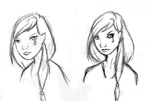
Have a look at the pictures below. Can you tell the difference between them?
One is clearly better than the other, yet I drew them both. The difference is laziness.
Remember back in grade school when men were boys and most of them ate paste? You were probably told that everything you draw is made up of basic shapes- circles, squares, and the like. Then the art teacher probably had you draw an egg-shaped face with creepy, serial-killer eyes and no nose. Well, your art teacher was right. Everything you draw is made up of a couple of basic shapes joined together. If you lightly sketch these shapes first they will help you with the proportions for your drawing.
The thing is that artists are lazy. At least, I know I am. Drawing these basic blueprints is boring and lame. We’d rather skip right to the juicy bits- chins and fingers and eyelashes and things! But when we do this, our quality suffers. The first of the two drawings is what happens when I work without those ever-helpful guiding shapes. Sure, all the individual bits are there, but they don’t go together. One eye seems to be making a break for the ear, and the hair, I’m pretty sure, is really a toupee. She also has a broken neck.
What your art teacher probably didn’t tell you is that drawing using basic shapes doesn’t just give you a sense of proportion, but also its perspective. A case in point: our mutant girl in the first drawing has her eyes at a more frontal angle than her face allows for. That’s why one eye looks like it’s in the wrong place.
Her better looking sister, on the other hand, benefited from a blueprint of basic shapes. As I drew her I realized that the head was actually tilted down slightly and that all her facial accessories should follow suit.
Most artists I know get lazy at some point and skip this most basic of steps. We really shouldn’t be surprised at the monsters we create as a result. Perhaps we should unleash them on Tokyo…


No comments:
Post a Comment